
There’s something about the desert that stays with you.
I’ve spent long stretches of time in Joshua Tree National Park, wandering through the quiet sprawl of the Mojave Desert, and standing on my own 40 acres in Northern Arizona with nothing but horizon in every direction. And every time I go back, it’s the color that hits me first.
Not loud color. Not tropical, not lush.
Desert color is restrained. Intentional. Patient.
The Slow Burn of Sunrise & Sunset
In the desert, sunrise and sunset don’t just “happen.” They unfold.
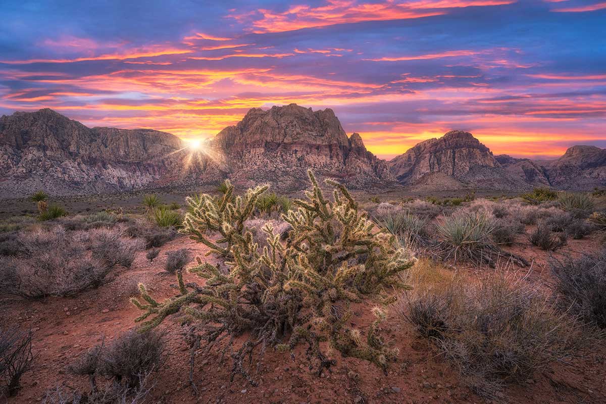
Soft blues bleed into lavender. Pale peach becomes saturated coral. Dusty rose drifts into violet. The sky feels layered—like watercolor paper soaking up pigment slowly. The absence of humidity in desert air allows light to travel cleanly, scattering differently and stretching the spectrum in subtle ways. Physically, it’s atmospheric science. Psychologically, it feels sacred.
Those purples and pinks against muted sand and stone create contrast without chaos. It’s bold, but it’s not overwhelming.
That balance is addictive.
Neutrals That Aren’t Boring
People think of the desert as beige. But desert “beige” is complex. It’s warm limestone, sun-bleached bone, dusty clay, weathered adobe, pale sage. These tones sit comfortably in the background, creating visual quiet. From a design standpoint, they lower cognitive load. Our brains don’t have to work hard to process them. They calm the nervous system.
Research suggests warm earth tones can create feelings of stability, safety, and groundedness. These are the colors of soil, rock, and shelter—of something ancient and unmoving.
In a world that scrolls fast and shouts loudly, desert palettes whisper.
And we lean in.
The Greens That Feel Delicate
In the desert, green is never taken for granted. The dusty sage of a creosote bush. The cool, matte green of a succulent. The sculptural blue-green of a Joshua tree. These tones feel intentional against the sand, not abundant. They stand out not because they’re neon—but because they’re rare.
Scarcity heightens perception.
When wildflowers bloom after rain, the small bursts of yellow, magenta, or orange feel almost defiant. Like color insisting on life in a place that looks inhospitable at first glance.
There’s something deeply human in that.
Light as a Design Partner
Desert color doesn’t exist without desert light. The sun is harsher and more direct. Shadows are crisp. Midday bleaches things out; golden hour drenches everything in honey. Texture becomes part of the palette—cracked earth, rough bark, striated rock. The environment constantly shifts tone depending on the angle of the sun.
That interplay between color and light is something I carry into branding and design work. Not just choosing a palette—but thinking about how it breathes. How it shifts across mediums. How it feels in morning light versus evening glow. The desert taught me that color isn’t static.
It lives.
Space & Emotional Breathing Room
Maybe what we’re really drawn to isn’t just the color—but the space around it.
The desert offers negative space in abundance. Miles of it. The eye can rest. The mind can stretch. In visual design, negative space does the same thing—it creates clarity, hierarchy, focus.
Standing on my land in Northern Arizona, watching the sky move from blue to violet to ember, there’s no visual clutter. Just layers. Just tone. Just gradient.
It’s a masterclass in restraint.
Why It Matters
Desert color palettes aren’t trendy. They’re elemental. They’re about contrast without noise. Warmth without excess. Vibrancy that feels earned. They remind us that beauty doesn’t require abundance—it requires light, space, and patience.
Maybe that’s why I keep going back. Because in the desert, color feels honest.And when you’ve seen that kind of sky—purples fading into ink blue over quiet sand—you start chasing that feeling everywhere else.
Even in the work you create. Even in the life you build.